Tak 2a
Technical Elements Of Graphic Design
Change For Life Campaign 2013:
Change for life is a campaign that tries to make people change their diets and have more healthy lifestyles, change for life is aimed at families of all ages they have been making campaigns for years showing what all the fast unhealthy food you are eating actually does to your body internally and what it causes.
At the beginning of the campaign video, the video uses stop motion to portray how modern day families eat a lot junk food and tend to have an unhealthy lifestyle as well. The characters are made out of play dough to make the campaign video seem more family oriented and they use bright colours because young children tend to engage with bright colours and stop motion because its an form of animation.
In the video there are four scenes and there are four cuts which are long and consistent because the audience need time to establish what is going on in each scene. Each time there is a cut they use the same stop motion animation for the first three where the human hand carries the couch with the people on it and places them in the next scene.
The images are related to the video because it shoes all the fat and sugar in foods/drink and the video is trying to get people to stay way from these foods/drinks, the background connects and relates in the final cut scene because its positive and at the end they show how families can turn their negatives into positives with healthy eating; furthermore its child friendly music and its very child-like this would be used to keep the children engaged with the campaign video.
Poster:

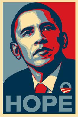
The poster has a mid shot of Barack Obama which takes up the whole poster and underneath in all capitals it reads hope, the text is "air force blue" and blue connotes loyalty, trust, faith and hope and this is what the poster is trying yo connote o the audience which would be adults of the American public, there are no titles and the point of focus is Barack Obama because this is his presidential campaign poster and the public need to be able to see what he looks like; additionally, the colours used are red and blue which fade into white in the middle and these represent the colours of the American flag.
The whole purpose of the poster was to get peoples attention towards Barack Obama because he was running for president he eventually succeeded however, the designer used one word "HOPE" this is because all presidents during their campaign speeches they'all talk about hope but people found Barack Obama to be different as if when you see his face and see hope that you should believe that hope is indeed possible.
Website:

Asos is a website which sells clothes and fashion for men and women, also its a delivery service so they deliver clothing to your house. This website sells clothes for men and women its very neat with a image of people of different colours and race, it has the logo on the left corner and has a search bar in the middle at the top to search for certain things. On each side they have tabs for men and women you click on it and it shows clothing items that are available; furthermore these tabs are very beneficial and accessible because you don't have to search for what gender of clothing you want.The font is big and bold which makes it visible to see also it sin black with a white backdrop which stands out. There are no sounds and hyperlinks are used to access different pages instead of having to open every page also there is a refined search bar which very useful because you can specify exactly what you want e.g. size 9 Nike trainers.
At the beginning of the campaign video, the video uses stop motion to portray how modern day families eat a lot junk food and tend to have an unhealthy lifestyle as well. The characters are made out of play dough to make the campaign video seem more family oriented and they use bright colours because young children tend to engage with bright colours and stop motion because its an form of animation.
In the video there are four scenes and there are four cuts which are long and consistent because the audience need time to establish what is going on in each scene. Each time there is a cut they use the same stop motion animation for the first three where the human hand carries the couch with the people on it and places them in the next scene.
The images are related to the video because it shoes all the fat and sugar in foods/drink and the video is trying to get people to stay way from these foods/drinks, the background connects and relates in the final cut scene because its positive and at the end they show how families can turn their negatives into positives with healthy eating; furthermore its child friendly music and its very child-like this would be used to keep the children engaged with the campaign video.
Poster:

The poster has a mid shot of Barack Obama which takes up the whole poster and underneath in all capitals it reads hope, the text is "air force blue" and blue connotes loyalty, trust, faith and hope and this is what the poster is trying yo connote o the audience which would be adults of the American public, there are no titles and the point of focus is Barack Obama because this is his presidential campaign poster and the public need to be able to see what he looks like; additionally, the colours used are red and blue which fade into white in the middle and these represent the colours of the American flag.
The whole purpose of the poster was to get peoples attention towards Barack Obama because he was running for president he eventually succeeded however, the designer used one word "HOPE" this is because all presidents during their campaign speeches they'all talk about hope but people found Barack Obama to be different as if when you see his face and see hope that you should believe that hope is indeed possible.
Website:

Asos is a website which sells clothes and fashion for men and women, also its a delivery service so they deliver clothing to your house. This website sells clothes for men and women its very neat with a image of people of different colours and race, it has the logo on the left corner and has a search bar in the middle at the top to search for certain things. On each side they have tabs for men and women you click on it and it shows clothing items that are available; furthermore these tabs are very beneficial and accessible because you don't have to search for what gender of clothing you want.The font is big and bold which makes it visible to see also it sin black with a white backdrop which stands out. There are no sounds and hyperlinks are used to access different pages instead of having to open every page also there is a refined search bar which very useful because you can specify exactly what you want e.g. size 9 Nike trainers.

Ok this is lacking graphic design key terminology?!?!?!
ReplyDeleteThis would be a level 1 pass.
Re-draft & submit by 13/04.
Also where is task 2.B
ReplyDelete